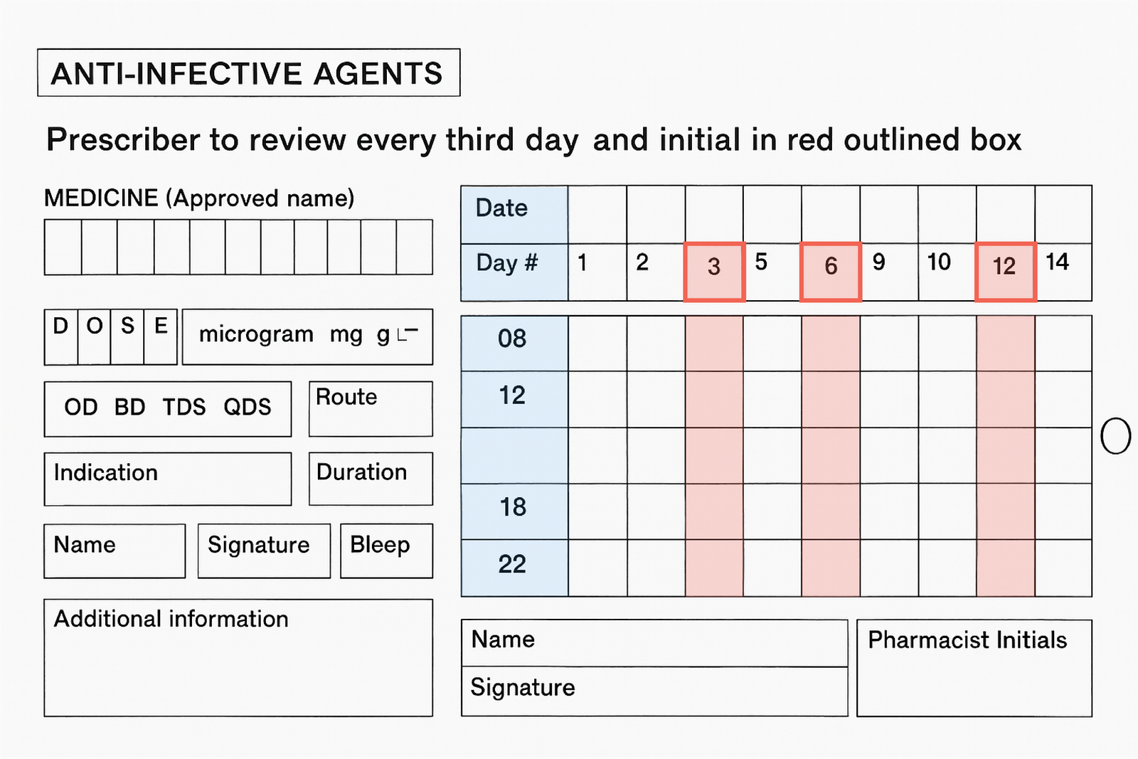
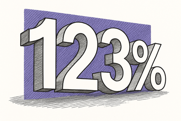
Prescribing errors cost lives. But in most UK hospitals, doctors still use handwritten drug charts. Think cluttered, cramped, and easy to get wrong. At Imperial College Healthcare NHS Trust, critical details like dose, duration, and even the prescriber’s name were regularly left blank. So a cross-disciplinary team rebuilt the paper chart using behavioural design. No new training. Just a better form. The result? Safer prescribing and a 99.4 % name completion rate, up from zero.
At a glance
- Audience: Foundation‑Year hospital doctors
- Exposure · Duration: 29 doctors · one‑hour in‑situ simulation
- Location: London, UK. Imperial College Healthcare NHS Trust
- Project type: Beta test (live simulation)
- Delivered by: Imperial College London & UCL design team
- Client: Imperial College Healthcare NHS Trust
Problem:
Solution:
Outcome:

A checklist at the start of the form breaks the job into clear, bite-sized actions and walks the prescriber through each one.

Removing confusing areas, adding additional to simplify input. In a booklet format with patient details always in view.

Vital information, like allergy informtion, was on every page and highlighted in red.


